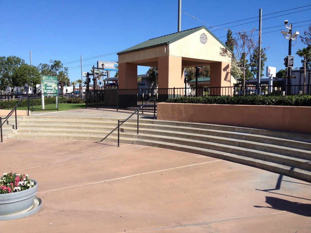
[sigh] You don’t have to be an urban planner, or a designer, or an architect, or have any interest in how built environments improve our lives. You just have to want to go up stairs and GET somewhere. Let’s look at a wonderful solution to a trolley station that’s next to an urban plaza.
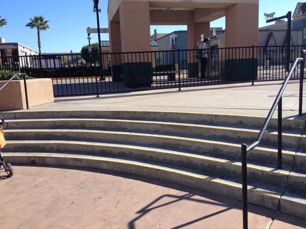
Originally this would’ve made sense, a plaza with a fountain (from yesterday’s post) adjacent to public transportation. Why doesn’t the plaza work? No niches, not enough planting, absolutely no shade, isn’t inviting, nothing to look at, and nowhere to sit. For a start. But it’s hard to make public spaces function well…unless you look at any of the successful tiny plaza and parks built in Europe over the last few hundred years and just copy them, with the appropriate street traffic and density. But here we’ve got an unused plaza that, at best, is a place for a child to play in the fountain for a few minutes while passing through. Fine. What’s a great way to make it much, much worse? Fence off the ENTIRE TOP PORTION. Look more closely at what’s happening here:
Yep, stairs to nowhere. If you want to go through the plaza to get to the trolley station you have to walk all the way to the end of the block, or do a parkour move over the fence while pushing a stroller and carrying bags of groceries. The fence completely seals off the station from the plaza, and the fence is put in a seemingly arbitrary location that allows for unusable space on both sides. Why fence at all? There’s a problem with crime where people hop off the trolley, mug someone, and hop back on. This is not an unpredictable problem with any public transportation system anywhere in the world. If the plaza was filled with people this wouldn’t be happening. Now the final stage of castration of the plaza is complete, eliminating the function of the stairs, ramps, and landing. You don’t have to be a designer to have your shoulders slump at this, just someone who wants to go from here to there.


